Wednesday, May 19, 2021

Fine Art Gallery: Step Up Your Cards

 Yesterday's Facebook Live did not go the way I had planned.  When I started making my cards for demonstrating on my "Tuesdays At Two" Facebook Live I had one idea in mind.  When I got to the third sample card, well it changed my mind entirely to a different card.

I knew I wanted to use the "Fine Art Gallery" bundle. I think the flowers are simply gorgeous and look like something from a painting, as the name implies. The video from yesterday is below, if it doesn't show up on your mobile device, click here.


This is the card I made during the video. I CASE'd it from Julie Gilson and added my own little twist to it using negative and positive pieces from the die cut on the sentiment.  

In the video I show how you can step up your cards, a simple card for the beginners. This card is simply stamping and a few cuts with your paper cutter. The sentiment is simply stamped right on the card base. A few epoxy dots are added to dress it up a bit.


This second card is a step up from that for the casual stamper.  It has an embossed background layer, using the "Painted Textures" 3D embossing folder. I also punched a background layer for the sentiment and popped it up with a couple Dimensionals. Both of the layers for the flower are scored around the edges with the Stampin' Up!© Paper trimmer. 

This third card, for the more Avid stamper, has two embossed layers, die cut images and a bit of Baker's Twine as well as a die cut sentiment. 

I also showed another card using the Painted Textures 3D embossing folder and some Pumpkin Pie ink. This card was CASE'd from Patty Dolan.  I used a different die cut for the sentiment, from the Scalloped Contours die set.  I was totally surprised when I found that it leaves little cut marks around the edge of the die, so you could actually slip something behind it.  I couldn't think of anything so I left it as is. 
These last two card were actually my original ideas on how to use the negative parts of a die cut as well as the positive die cuts from the "Just Wanted To Say" die from the Floral Gallery dies.  I love how they both turned out. I used the coordinating "Fine Are Floral" DSP.

Positive die cut image
 

Negative die cut image
 

Dimensions of the Avid card:

Whisper White:
  • 8 1/2" x 5 1/2", scored at 4 1/4"
  • 3" x 4 1/4"
  • 4" x 5 1/4"
Magenta Madness:
  • 3 1/8" x 4 3/8"
  • 4 1/8" x 4 3/8"

SUPPLIES: purchase the supplies with one click here.

Art Gallery Bundle
#156227

Art Gallery stamp set
#154421
 

Floral Gallery dies
#154316
 

Scalloped Contours dies
#155560


Dainty Diamonds
3D Embossing Folder
#152702

Painted Texture
3D embossing folder
#154317

Fine Art Gallery
Designer Series Paper
#154558

Basic White cardstock
 #159276


Magenta Madness
#153117
 

Magenta Madness cardstock
#153080
 

Old Olive
#147090
 

Everyday Label punch
#144668
 

Mossy Meadow
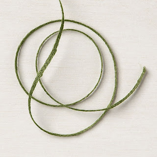
Braided Linen trim
#154298
 

Stampin Dimensionals
#104430
 

Stampin Seal+
#149699

2020 - 2022 In Color
 Square Gems 155572


Thank you for stopping by.  If you enjoyed these projects, please subscribe!

Sharon Brennan

Images© Stampin' Up!


My intent was to show 

No comments:

Post a Comment

Tips on Organizing new stamp sets & dies/bundles and using Pinterest

 Not being organized makes me go in a tizzy!  I like to be able to put my hands on a stamp set when I'm creating a card.  Looking for a ...